Creating Effective Call To Action Buttons
Call to action buttons are extremely useful not only to increase immediate sales. Ease the customer journey with CTAs by countering objections, giving further information and more.
Day 27: C. T. A.
We’ve used these three letters plenty of times on this course — but now it’s time for you to master them.
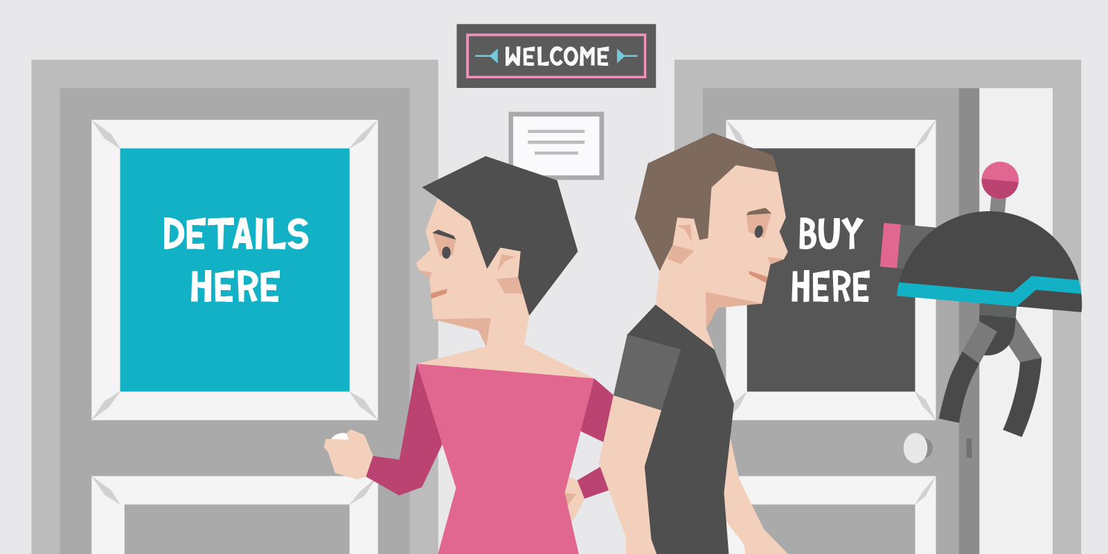
Calls To Action (best known as CTAs) are “instructions to the audience designed to provoke an immediate response”.
Every time you see Learn More, Call Now, Get Started or Sign Up on a website, that’s a CTA.
And if you’ve ever clicked on one, then the CTA worked.
You’ll notice the examples above aren’t strictly sales-driven. A CTA doesn’t need to say Proceed to Checkout or Finalize Purchase to be a CTA, it just needs to take you from one place to another.
For this reasons, CTAs are sort of like portals. Enter at Point A, end up in Point B.
The trick is to let people know where they’re going before they click. After all, you wouldn’t take a portal without knowing where it was going. Unless you’re a real badass.
The same rules apply to to websites, and it’s why your CTAs need to be perfect.
Let’s get to it.
Primary CTAs
Drives the sale
Look at these examples from Oak Street:
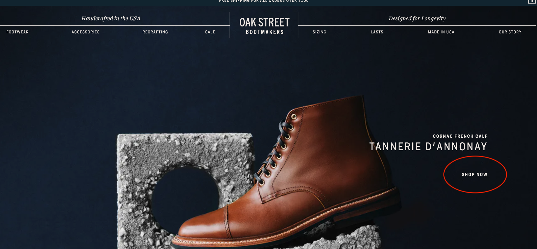
Shop Now immediately gets you into that sales funnel. That is why you’re on the website, after all.
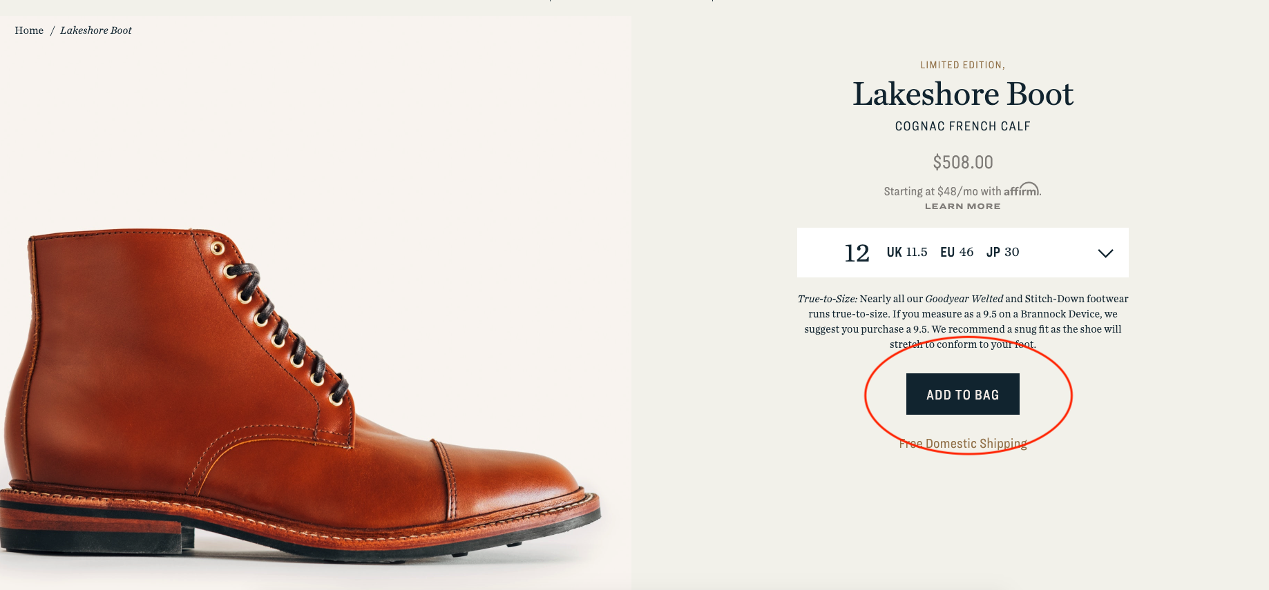
You’ve found a shoe you like. What next? Add to Bag keeps you moving forward. The sale is in sight.
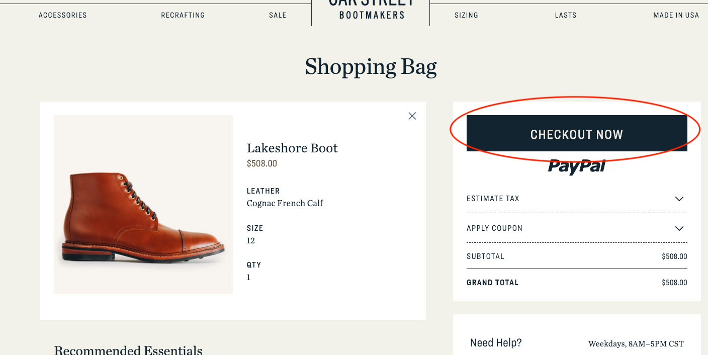
Now it’s time to finalize the purchase. Checkout Now does the job.
Oak Street, therefore, has a 3-click sales funnel from homepage to checkout. No “finding out more about the product”, no “Learn about what makes us different”. Each CTA is a Primary CTA because it focuses on the sale, the sale, and the sale.
And it works.
Now let’s look at Mailchimp.
Their Primary CTA is much more straightforward. It leads to their pricing plans and sign up.
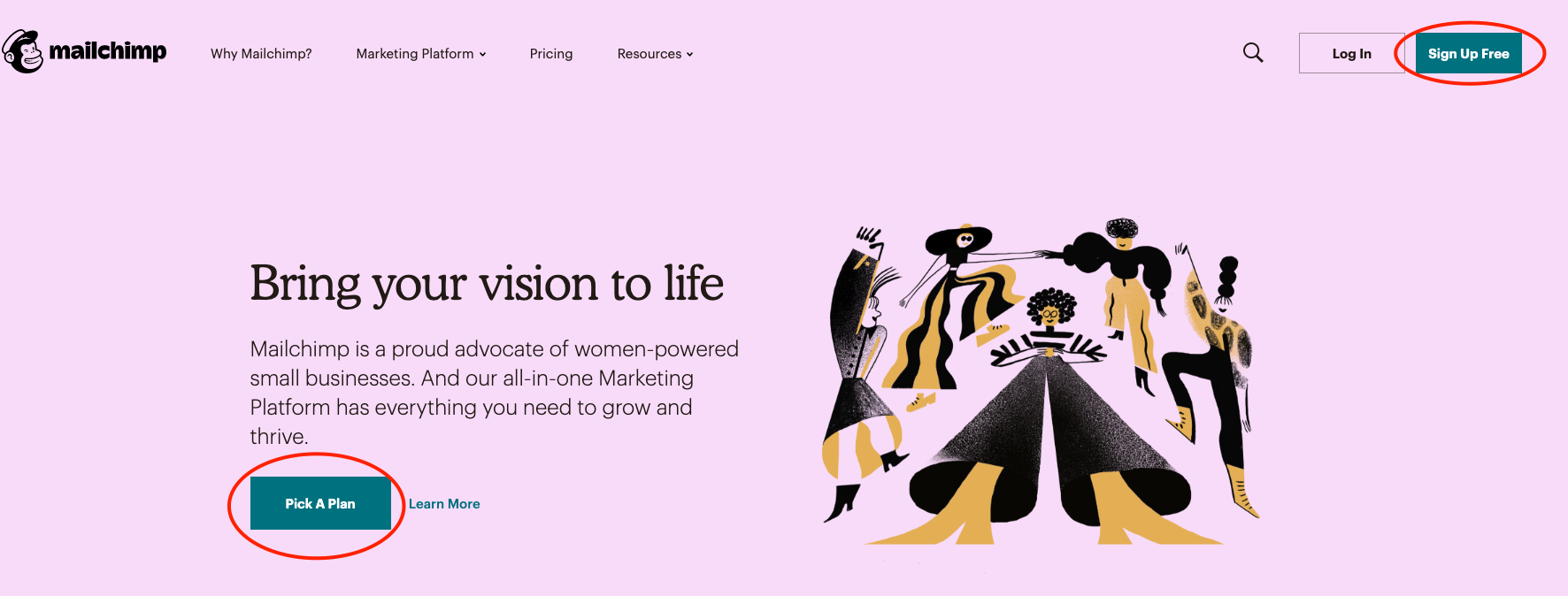
Two clicks, this time, and they cut through all the noise.
But can we find a one-click sales funnel?
Of course we can.
Check this out from Backlinko.
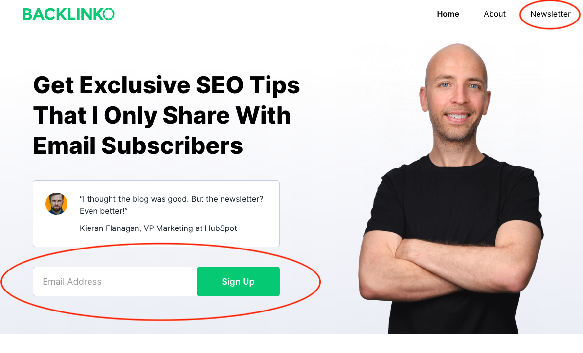
Bam. No frills.
The point is, your Primary CTAs are dependent on what you’re selling, and how you sell it.
Imagine if Oak Street only had one CTA. You click on a shoe and it takes you straight to checkout. You’d shit yourself. Are we allowed to say that? Probs not. But the point remains, a bad set of CTAs will kill your sale.
Secondary CTA
Indirectly assists conversions
If Primary CTAs are about driving the sale, Secondary CTAs are for everything else:
- gathering information
- countering objections
- detours (same destination, different route)
- alternative options
Secondary CTAs also have a couple more rules you need to play by:
- never overshadow the primary CTA
- always stay in context
The first point is obvious — and your users will actually thank you for this.
For example, Secondary CTAs that look like a Primary CTAs lead users to information gathering pages they don’t want — you’re just slowing them down.
The second point is a bit more nuanced. Your Secondary CTAs should be a direct response to the text around them.
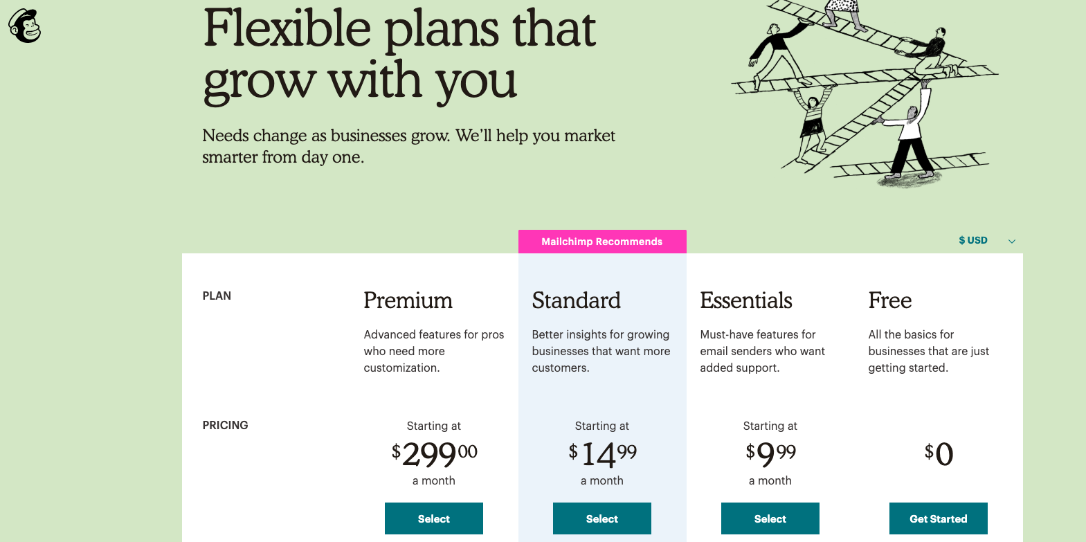
Here’s Mailchimp again:
Pick a Plan is the Primary CTA here, but Learn More is directed at the users who haven’t made up their minds yet (which, by the way, is most of them).
The Learn More button is a really clever device for online businesses.
They’re our way of saying to our users, “Yeah, that copy above is cool and all… but we understand that it doesn’t explain everything. The rest of the information you need is here, and we’ve linked it for you — because you’re probably not ready to click the Primary CTA yet!”
Secondary CTAs are empathetic like that. You just need to make sure that the stuff on the Learn More page answers their questions.
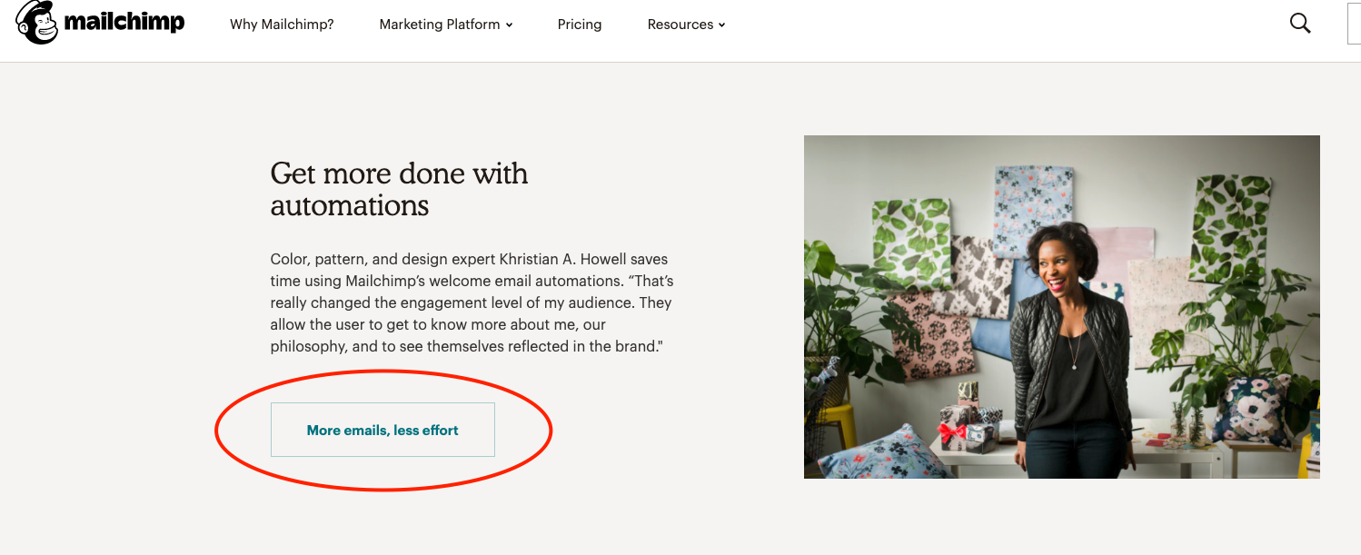
Here, the Secondary CTA is More emails, less effort. It hints directly at the copy above it and sends users to a page specifically about that feature, without actively chasing the sale. Context, context, context.
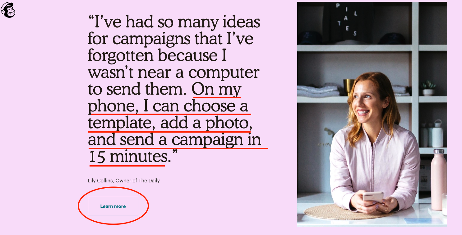
This Secondary CTA follows a testimonial that talks about mobile usage, and takes users to a page about mobile usage. Everything matches up, and the user is happy.
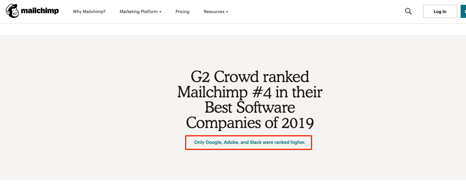
This Secondary CTA links to a reviews site where users can see Mailchimp’s ranking for themselves.
This is a good example of countering objections using CTAs.
The best bit, people will trust that link without clicking on it — no business is dumb enough to link to something that calls out their lies. The mere presence of the link gives credibility to the claim that came before it.
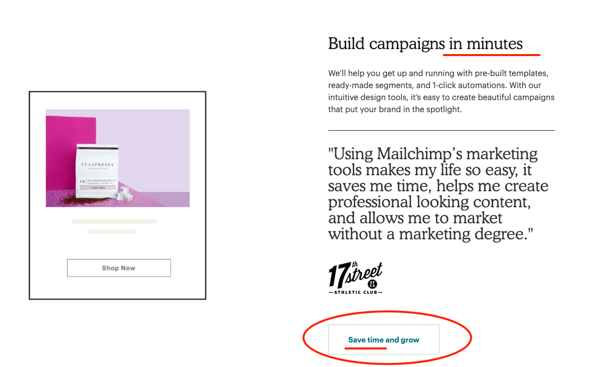
Again, context is key. This Secondary CTA forgoes generic actions like “Learn more” and focuses instead on the context of the text that came before it. Very clever UX writing.
Here’s a summary
You need Primary and Secondary CTAs to make the most of your website.
While Primary CTAs focus on the sale, Secondary CTAs pad out your user’s knowledge of your product before they go back to the Primary CTA funnel.
Here’s a few tricks to get you on the path of CTA domination:
- Determine each stage of your funnel upfront
- Where is the user in their customer journey? Use Primary and Secondary CTAs accordingly
- A user on the Pricing page will likely be further down the funnel than someone on your About page.
- Make sure your Primary CTA stand out
- Don’t overdo it. Too many CTAs and the paradox of choice kicks in
- Make CTA text clear. Clarity trumps cleverness
- For contrasting CTAs (“Submit” and “Cancel” on a form for example), both buttons must be clear
- Keep design consistent. If you’re using blue buttons for your Primary and outlined buttons for your Secondary CTAs, keep them the same throughout the site.
These are just a few guidelines, but in the end what you do on your pages, always depends on your business goals first.
Your homework:
Choose the most important page of your website and audit/optimize your CTAs.
Can you reduce clutter in a section to make your Primary CTA stand out?
Can you add an alternate path for users who aren’t ready to buy, using a Secondary CTA?
Can you differentiate your Primary and Secondary CTAs with color (remember the previous post)? If you can’t, turn your Secondary CTA into a text link or outlined button.