Overcoming Sales Objections With FAQs
Users questions are a great way to learn about their expectations. FAQs aren’t only useful to avoid support questions, but also to counter objections that customers might have.
Day 23: Reading Minds
You never know what kind of objections people use as an excuse not to buy your products.
It makes sense, though.
Humans are risk-averse creatures. It’s part of our fight or flight response to stimuli.
If a bush rustles menacingly, do you sit there and hope it’s a mouse, or assume it’s a lion and run?
This is how people make decisions every single day. And the thing that keeps our heartbeat steady usually wins.
But what if that bush has a sign next to it that says “Don’t worry about this bush. A small family of mice lives in it. The bush may rustle, but your safety is guaranteed. You can come look at them if you want.”
Not only will your heartbeat steady, but you may even take a look at the cute mice.
We need to do the same thing with your website. Steady the heartbeat. Keep the stakes low. Encourage a closer look.
The good news is, there’s a really easy way to do that.
FAQs (Frequently Asked Questions) have the power to counter any lingering objection in your prospect’s mind.

What makes a good FAQ?
FAQs become stronger with more investment. The more research and customer pain points you’re aware of, the better the FAQ.
Here’s where to look:
- Support tickets
- Email inquiries
- Complaints (gold mine, btw)
- Live chat tools
- Website polls (through platforms like Hotjar)
Here are some great questions to ask through Support or Website Polls:
- On Product/“How it works” page:
- Do you have any questions that aren’t answered on this page?
- What’s your biggest fear about purchasing X/becoming our client/subscribing? How do we fix it?
- On Checkout page
- What’s stopping from completing your purchase today?
- After checkout (in emails, exist surveys on Thank You page)
- Was there something that made you hesitate before you made your purchase? If so, what?
- What was your biggest frustration during your visit to our website?
- Which questions did you have but couldn’t find answers to on the website?
The answers to these questions will literally provide you with the exact Q&As you need to include in your FAQ page or section. It’s like reading your visitors’ minds.
A few caveats though…
FAQs need to be easy to read and scan
Your prospects don’t want to trawl through every question in your FAQ. They want the information they came looking for, then they want to leave.
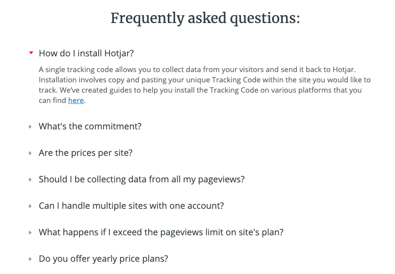
Use headings for questions so they are easily scannable. Like this example from Hotjar:

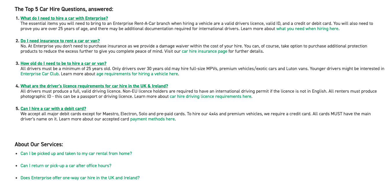
And if you want an example of what not to do:

If you’re reading that, may the Lord have mercy on your soul.
However…
The first section is almost a good idea. It provides the top 5 most asked questions upfront (great) but also shows the answers (not great). Furthermore, the text is tiny and it spans the entire page. Shite, basically.
if they had done the Hotjar thing, it would have been the perfect FAQ. Alas…
Considering the context
Once you’ve gathered information from emails, tickets, poll responses etc., you’ll start noticing trends that will dictate how your FAQ looks. You may need an entire section for payment information, while onboarding may need only one or two questions.
If this is the case, put more FAQs on your website.
But to get the most value out of them, you’ll need to use them wisely. Having an FAQ on every page will be overwhelming, and visitors may have difficulty finding the FAQ they’re looking for.
Be smart.
Your homework:
Create one or two website polls with Hotjar with the intention of making your FAQs objection-proof.
You should already know your main conversion pages are — use those pages for now.
You can use the questions we provided or some of your own. Just make sure they’re open questions that give relevant feedback.
PS. in case you need it, here’s more information on Hotjar web polls.
