Adding Visual Hierarchy to Your Design
Sending your message across with simple design and content can be tricky if you don’t consider visual hierarchy.
Day 25: Squeaky wheels get the grease
“All the news that’s fit to print”, this was The New York Times’ motto when it was founded in 1851.
And this was what the front page looked like:
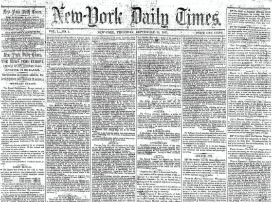
Wow, they really meant it.
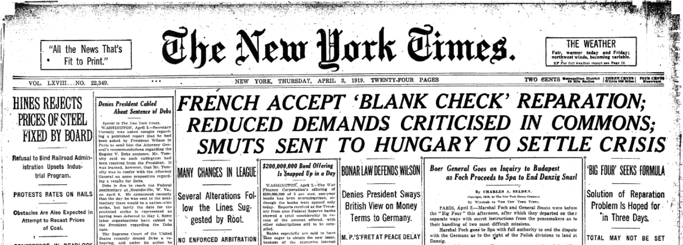
In 1919, they had upgraded to this:
And this is what their homepage looks like today:
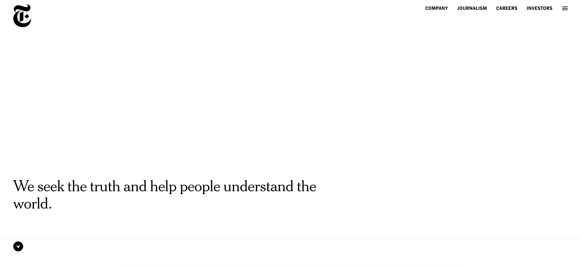
Talk about a change.
The lesson here is pretty simple, but vital if you want to sell online.
“The squeaky wheel gets the grease”. In other words, your attention goes to the thing that most needs fixing.
But how do you do that?
Let’s take a deeper dive
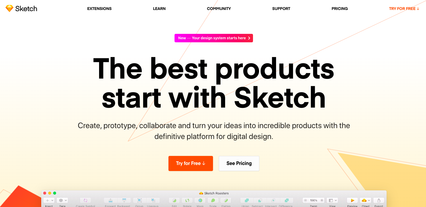
Certain websites focus heavily on design, and throw copy out the window:
This is no bad thing. Indeed, it works brilliantly for big brands who want to showcase a particular product (remember the Apple example from a previous post?).
This is what we call aesthetic design, and it counts for about 50% of your customers’ perception of your website. According to this study, at least.
But what about the other 50%?
Today, we’re talking about visual hierarchy.
Visual hierarchy is the way you prioritize information on your page. As you’d expect, the most important stuff comes first.
It’s why a New York Times news story has the headline at the start. It’s why the on/off switch on your remote control is big and red. It’s why a restaurant menu has the starters first and the desserts last.
Visual hierarchy, therefore, guides your readers’ eyes to the best bits first and the boring bits last. If you can create a visual hierarchy that meets your customers’ expectations… $$$.
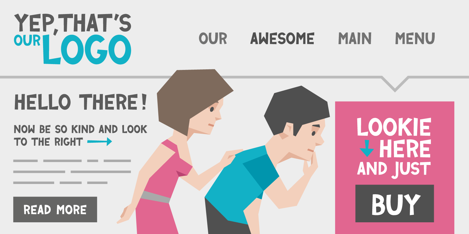
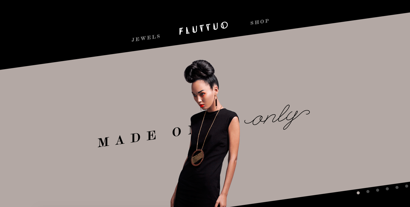
The website in the example above sure looks great, but imagine if it didn’t have the “jewels” or “shop” options. It would be an aesthetically pleasing website with no visual hierarchy (it would just be a nice picture with nowhere else to go).
In an ideal world, visual hierarchy and aesthetics go hand in hand, but if you’re going to do one… well, you already know the answer.
Here’s two examples of websites with visual hierarchy as well as great aesthetics:
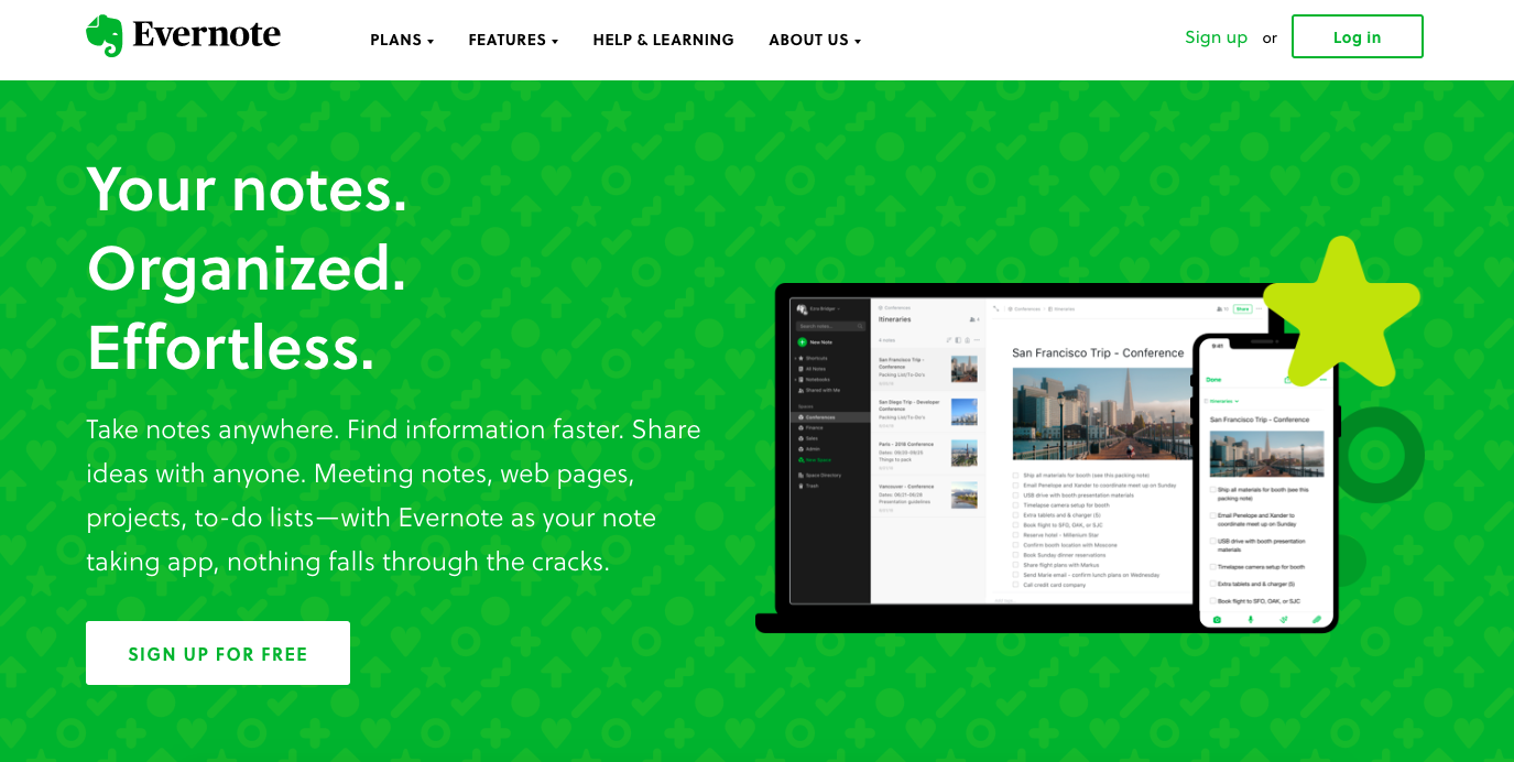
You probably looked at the image first (aesthetics), then the headline, then the copy, then the CTA (visual hierarchy). The font and background colours also count as aesthetics, by the way.
Bold, powerful headline. Explanatory subline. Great CTAs. Imagery to kill. 10/10.
How to Create Your Visual Hierarchy
There are five foundations you need to master for perfect visual hierarchy.
Size
The bigger the element, the more it stands out. But if everything’s big, nothing is. Use Size wisely.
Color
Use color and contrast to direst attention. For example, CTAs should stand out against your site’s background.
As an aside, make sure text is readable against your background.
Text
Text needs hierarchy, too. There are three levels of prioritization: headings, subheads and body copy. Too many headers on one page will overwhelm readers. Too few, and your page will look incomplete.
Put key content at the top of your page and find a natural end point.
Fonts
Your typeface has a big impact on how people perceive your brand. This doesn’t just mean the font style you use (serif, sans serif etc.) but also how you use stylings like italics and bold type. Use them too frivolously and you’ll lose your reader. But use them juuust right, and you’ll add a whole bunch of personality to your website.
Space
Space matters. White space (space between groups of text, images and sections) gives breathing room to your content, makes it easier to scan, and will actually help you organize your page effectively.
Your homework:
Do two of these three tasks:
- If you have heatmaps set up already, note what changes to your visual hierarchy you could make based on them data. If you don’t have any, set them up today!
- Go back to our lesson on Prioritization (Day 12). Compare your notes to what the page looks like now. Can you improve both your messaging and visual hierarchies?
- Try the squint test. Squint at your page so that all the details blur and see what stands out. Is that what you want your users to look at first? If not, how can you change it?