What Do Your Visitors Expect to See on Your Website?
Is the messaging in your website consistent? The importance of matching your customer needs with your value proposition.
Day 14: Does your website smell like shit?
Have you ever walked into a shop because it looked so great from the outside?

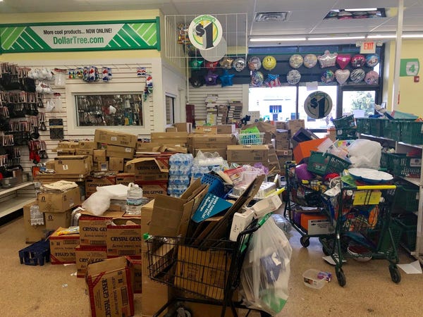
But the inside looked like this…

Not so inviting anymore, is it?
Many online businesses are guilty of this. They think that one pretty homepage or product page is enough to win customers over. Hint: it isn’t. At best, you end up with underdeveloped webpages with inconsistent design. At worse, you mislead visitors or leave them thinking you’re a scam.
The point is, more traffic doesn’t guarantee you more paying customers.
This is all about something called information scent.
Imagine the aroma from your favourite curry. You smell it and it hooks you. You’re suddenly hungry, and your mouth is watering. You follow the scent for a few blocks, and its source is… a BBQ joint.
Not what you expected. You’re disappointed, and you’re still hungry. You leave to find the curry you’re hankering for, and leave the BBQ joint behind (even though it smelled good).
The same thing is happening on your website. Whether they’re using Google or online ads, your prospects are looking for relevance. And if your offer isn’t relevant they won’t buy it.

Information scent states that users decide where to go next based on two key factors:
- How likely it is they’ll find what they’re looking for
- How long it will take to find it
The higher the users’ expectation to find the answer to their question (based on what they see on the site), the stronger the information scent. But be careful, if the scent is strong and the information is weak, goodbye new customer. They smelled curry and got BBQ.
The lesson here is: maintain consistency and relevance for your entire customer journey.
Here’s a pretty good example:


The value proposition on the site reflects the search engine result copy. It’s for business owners, and it offers a marketplace to find freelance services. The website’s main CTA is a search bar that makes the “marketplace” idea even clearer (without even having to mention it). Nice.
So:
- Information Scent is a real thing… and it’s important
- Good information scent sets relevant expectations for visitors arriving on your site
But it’s also useful for moving around a website.
Here’s a great example:


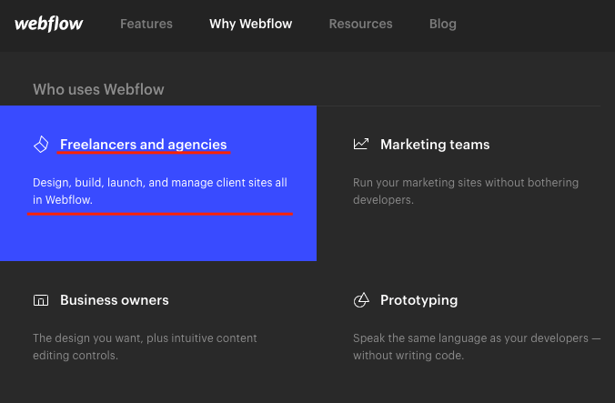
This is really great. Especially when you consider this website is speaking to not one, but four different target audiences! Well played, Webflow.
Their navigation menu has a short, benefit-driven blurb for each audience. The scent is delicious.
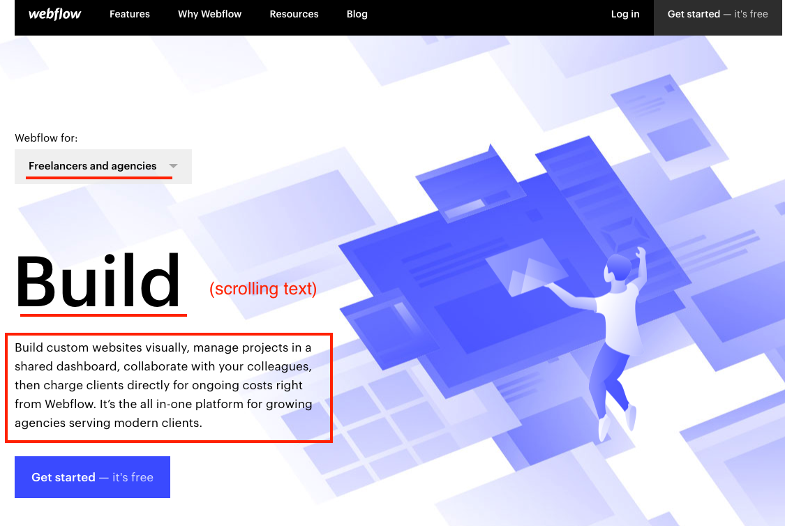
And once you click, you get a targeted landing page, digging even deeper into those benefits. We can almost taste the sale!
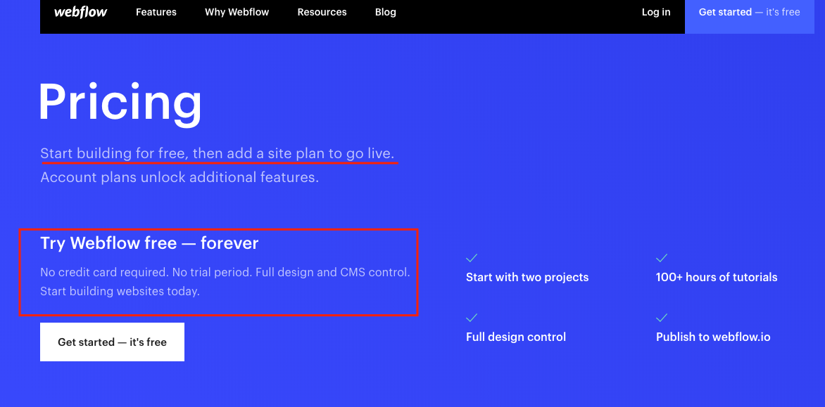
The same applies to their primary CTA (“Get started – it’s free”).
Anybody clicking that CTA would reasonably expect to find more information about the product being free to use. Hand over the nose pegs, it’s too much!

Shut up and take my money! …is what they’d say, such was the alluring information scent. (But it’s free, so they didn’t.)
And if that wasn’t enough, scroll down that page and you see a table showing the exact features (and limitations) of the free plan. Our noses can’t take anymore of this majestic information scent!
So to recap:
To understand the effectiveness of your information scent, ask yourself these questions:
- Does this website match what my customers are searching for?
- check your traffic sources, bounce rate
- Does my value proposition match my customers’ needs?
- check for support messages, bounce rate
- Does the text on my site match visitors’ intent?
- are they in the Search, Browse or Buy stage?
And to improve the effectiveness of your information scent, you need to review the following things:
- Link labels
- ensure text in CTAs matches (or is relevant to) the headline on the page it links to
- are they clear, concise and jargon-free?
- Content around links
- information overload near CTAs
- links hidden by cramped/busy design
- too many distracting images
- Context of the link
- are links on the correct part of the page
- is the link being used at a point of high enthusiasm, or high stress?
- Users’ existing knowledge
- what do your users know already? Do they need to learn about your product?
- Are they problem or solution aware?
Your homework:
You should already have a sitemap from a previous assignment. Your job today is to apply what you’ve learned about information scent to the page you’ve chosen as most important.
Make a list of all the following
- all traffic sources
- all links/CTAs on that page
- list of which pages the links/CTAs send visitors
When you have them, use the questions in the recap section to improve your information scent. The longer you spend on this assignment, the better your understanding of your information scent will be. And the better your nose for good information scent, the more likely you’ll be able to smell a problem when it arises.
Good luck!
