How to Choose the Right Fonts
Choosing fonts is part of building your brand. Ask yourself basic questions about your business that can help you shape which fonts you should use.
Day 29: De-mystifying Typography
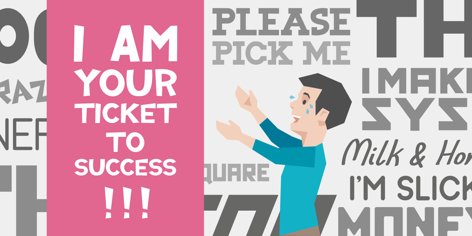
Typography isn’t all that scary. It’s just different styles of lettering, after all. Yet typography is still considered a space reserved for brave nerds or professional designers. Which it totally shouldn’t be, by the way — especially if it can make you money.
Yep — if you think a website packed with Comic Sans converts better than one with Helvetica, put your money where your mouth is and update your website accordingly!
But if you’re sane, you’ll know exactly what we mean. Typography is an extension of your personality as a business. Are you playful? Artistic? Serious? Chances are, you can use it to you advantage.
Notice the use of the word typography, and not simply typeface or font. Typography is an umbrella term for fonts, spacing, anything to do with how your words appear on the page.
What should you look for in a typeface?

What’s the difference between fonts and typefaces? You’ll hear about them interchangeably, but basically a typeface is a font family (say Helvetica), while a font is the specific variation and style of the parent typeface (i.e. Helvetica Neue bold).
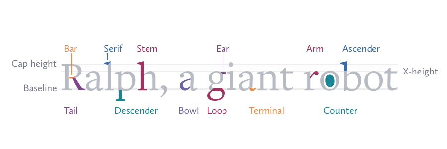
In any given typeface, the 5 most important elements to keep in mind are:
Serifs: the decorative strokes used to finish the ending of a letter. Any typeface without these strokes is called “Sans serif”
Baseline: the invisible line where letters sit
Cap height: the distance between baseline and the top of capital letters
X-height: the distance between baseline and the top of the lowercase letters
Counter: the empty space inside letters like A, O, B. The term for open letters (like C) is Aperture
Here’s a quick visual (with more terms):
Of course, a typeface must have easily-recognisable characters to succeed — but you knew that already.
Now that we speak the same language, let’s look at how you can find your fonts.
Finding fonts (the quick and dirty way)
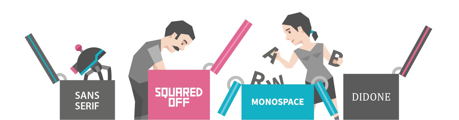
As a basic guideline, here’s how different fonts tend to be perceived:
- Sans serif = simplicity, friendliness
- Squared-off = authority, toughness
- Monospace = official documents (each character occupies the same space)
- Didone = luxury, class (didone fonts are thick on the vertical and thin on the horizontal, like they’ve been written with a quill)
Play around with these (free to download and use!) to get an idea of what your next typeface could look like.
Once you’ve found 3-5 fonts you would consider using on your site, you can move onto the next step.
Pairing fonts

Important: never use more than 2 fonts. Any more than two and your site gets messy. Save yourself the stress.
Now, narrow down your list of fonts to two keeping in mind that:
- 1 serif + 1 sans serif combination = safe, a good starting point
- Serifs are great for headings, especially with bold and aesthetically pleasing fonts
- Sans serif fonts are perfect for body text
- Don’t use wildly different fonts. They’re distracting and ugly
- Don’t use fonts that are too similar either. It creates visual conflict
- If you can find a good combination with two fonts in the same family (i.e. Helvetica), perfect.
Here are some tools you can use to quickly find good combinations. These examples will also give you ideas for how to style (bold, italics, underline etc.) your fonts to make the text easier to skim:
Your homework
Ask yourself if your website’s typography is settled. If not, play around with some new combinations that will resonate with your customers.
Have fun with this one, it’s a creative exercise.