How To Fix Navigation Mistakes That Are Ruining Your Website
Your visitors must be able to effectively navigate through your website, if not, they might get lost, frustrated and scare them away.
Day 13: Escaping the Maze
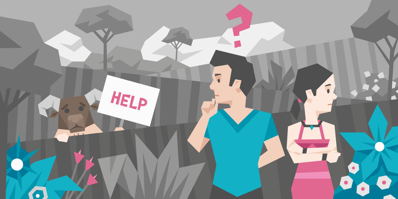
Imagine you’ve built an amazing garden and opened it up to the public. It’s filled with exotic flowers and offers views people could have only dreamt of until now.
Problem is — your garden is a maze. So intricate that once customers are in, they can’t find their way out. The excitement they came with quickly disappears, to be replaced by anxiety then frustration and finally resentment.
PS. The maze is your website. But you knew that already, cos you’ve made it to Day 13 on this course.
Today we’re talking about orientation. Bad orientation never ends in a sale. Great orientation has a big chance to make a sale, just because it’s so easy.
What is bad orientation a symptom of?
-
- Mega-sized menus
- Too many navigation links
- Too many (or confusing) dropdown menus
- Too many different CTA buttons
Notice how all of them are “big”.
If you have even one of these conversion killers on your website, our testers will find it and talk about it. They hate them.
Big menus give rise to the “paradox of choice” which leads into “decision fatigue” — basically, big menus means no sale. Big menus means “goodbye potential customer”.
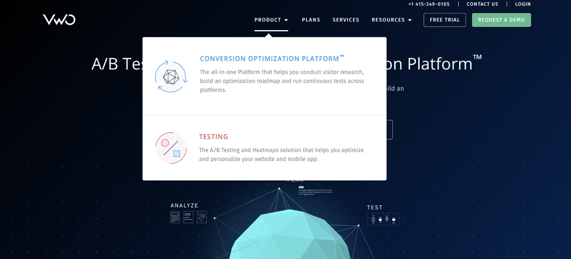
Take this example of a navigation menu:
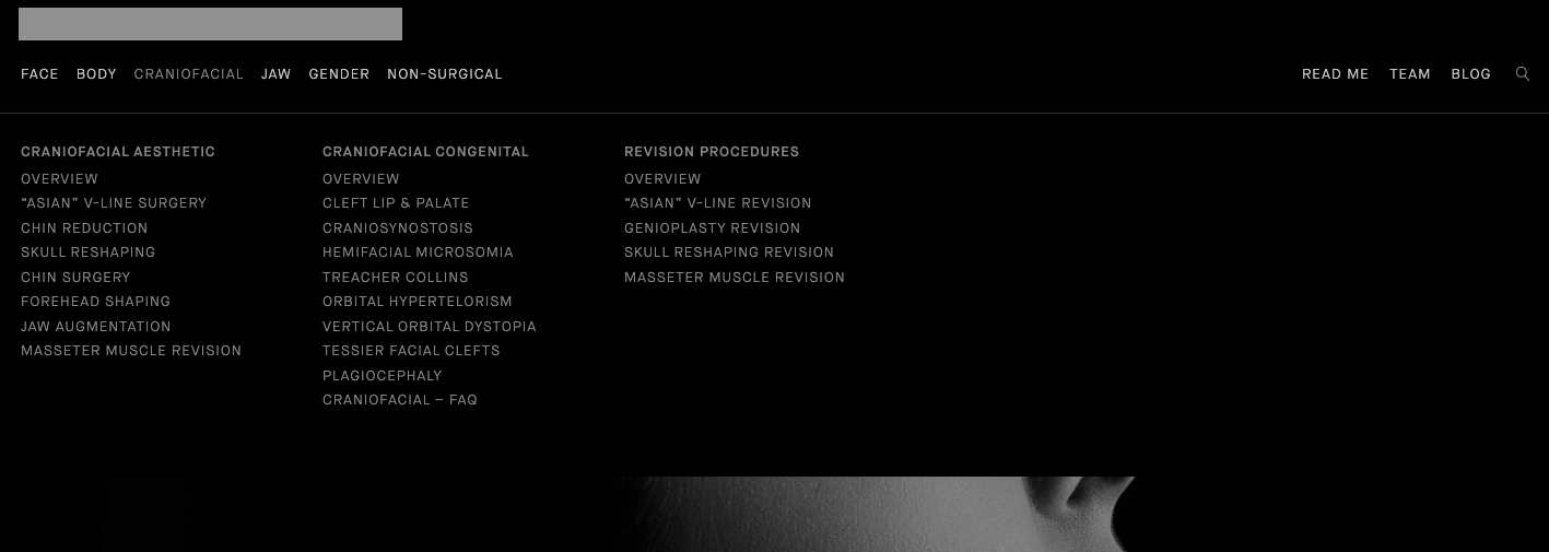
In short, it’s a mess.
- The menu takes up most of the page
- Items are too close together
- And the menu is opened up by hovering, not clicking (annoying when you’re just trying to move your cursor)
Bad navigation is a trap that any business can fall into. The more products you have, the harder it is to fit them all nicely on a page.
How do I present them?
Should I link to every sub category in my nav menu?
How do I group products?
How do I make everything work on mobile?
So. Many. Questions.
But, as always, there’s a way out.
By now, you should already know your ideal customer, and the goals you want your site to reach.
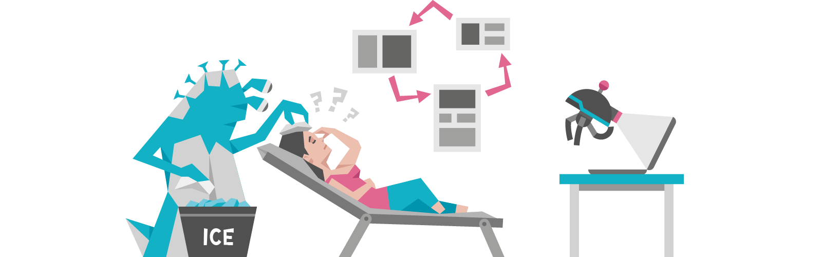
The best way to start improving your navigation is to create a sitemap.
A good sitemap will show you where to place CTAs, how to link your pages together and how to make user flows as seamless and effective as possible.
Here’s a template you can use as an example to work on your own:
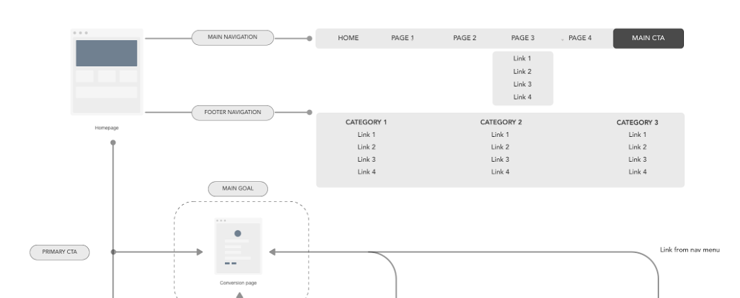
Use the template to structure your sitemap, keeping in mind your KPIs, your one goal and your avatar.
Ask yourself questions like:
-
-
- What does my ideal customer need to see on the homepage?
- What do they need to know in more detail before buying? (Aka, what page should my homepage link to?)
- Where should I place my primary and secondary CTAs so they’re easy to find, and match my visitor’s frame of mind?
- Which links should I put in my header and footer sections?
-
Meanwhile, if you have the “mega menu” problem, here’s a few ideas you can play with:
-
-
- Create subcategories for easier scanning
- Use a different design for each drop down menu
- Add space between lines to give menu items breathing space
- Make users click on a menu to see what’s in it (no hover triggers)
- If you can’t make a case for including a link, delete it!
-
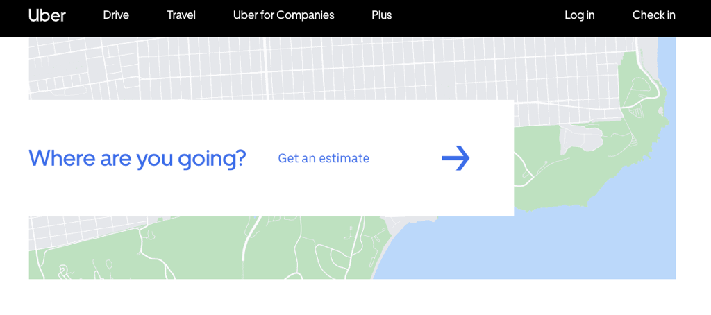
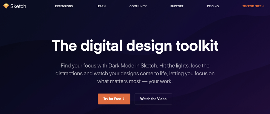
Here’s some great examples of how simple = effective:
Your homework:
Create your own sitemap using the process we described. Try one of FlowMapp, Stormboard or Whimsical to do it. Or if you’re feeling lazy today, just sketch it by hand (in pencil, not pen). What’s important is that you take the time to think about it, and then use it to actually build the structure of your website.
This will save you countless hours down the road, and give you the peace of mind of knowing that your users will be able to find what they’re looking for without constant hand holding from you.