Social Proof and Value Propositions: How to do them properly
The visitor’s first impressions of your website determine how trustworthy your business is, and if it’s worth their attention.
Day 15: Speed dating
First impressions matter. Even on your website. In a recent study, researchers found that “visual appeal can be assessed within 50ms, suggesting that web designers have about 50ms to make a good first impression.”
If you want to make your visitors trust you fast, there are two very important elements of persuasion you should consider. Social Proof and Value Proposition.
Your users are wired to look for the most credible source of information, so your website should prove its credibility from the moment someone lands on your homepage.
Examples include:
- “Featured in/As seen on” logos (especially if they are known to your audience)
- Customer testimonials (include a photo, name and role if you’re a B2B seller)
- Clients’ logos (if they’re well established and recognized)
- Video testimonials (make ‘em short, 1 minute max)
- Case studies (make ’em visual and interesting!)
- Awards and trust badges
All of these contribute in creating trust and authority for your brand.
Don’t just bung them all over your website; it’s better to have a testimonial about a certain product on that product’s page, for example.
Basically, you want to say “We kick ass” throughout your entire website – and it’s better for other people to say it for you.
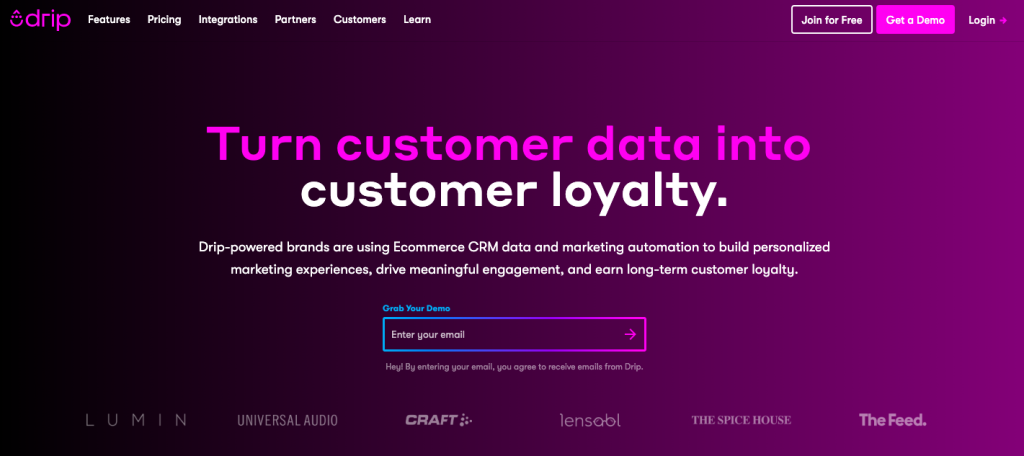
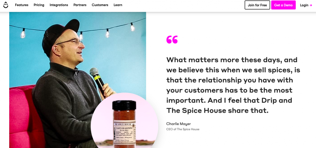
Here’s some very clean examples (as you can see, you don’t need to go overboard with this):


Still not perfect…
Let’s say your site is packed with great testimonials, awards and social proof… but visitors are still leaving after seeing just one or two pages. Where do you go from here?

We’ve tested this on hundreds of websites and the main problem online businesses face at the start of their conversion funnel is their value proposition.
It’s becoming a buzzword, but what really is a value proposition?
Wikipedia defines it as:
“…a promise of value to be delivered, communicated, and acknowledged.”
What a load of baloney. Forget that nonsense — your value proposition is nothing more than:
- What you do
- Who you do it for
- What’s unique about it
It really is that simple. Yet, so many get it wrong.
For example, let’s take a look at this design from Dribbble.com, a site for designers:

If you landed on this page without already knowing the company, you’d be completely lost. Let’s test it against our three-point list…
- What do you do? Literally no idea.
- Who do you do it for? Farmers? Stamp collectors? Middle Managers?
- What’s unique about it? I don’t even know what it is!
And then you’d probably leave the site. No return visit. No sale for Dribbble. No word of mouth from a happy customer. No snowball effect. All because the homepage doesn’t have a value proposition.
PS. Dribbble’s homepage is much better:

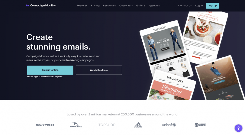
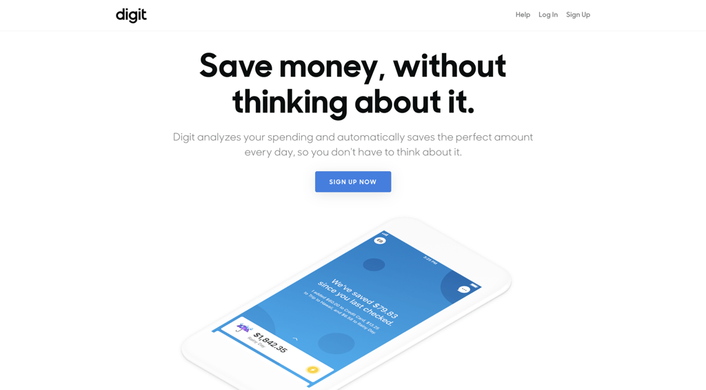
Here’s some more good examples of good value propositions:

“Create stunning emails” is excellent copy, by the way.

“Save money without thinking about it” – sign me up!

You’re starting to notice a pattern — all these sites use clear, descriptive language — the language their customers use. Jargon is a barrier to sales. Ditch it today.
Today, you’ve learned what goes into creating a great first impression for your visitors. It’s all about credibility, trust and composing the right message for the right people.
But you need to take a walk in your visitors’ shoes to understand what they really think of your site, which leads us to…
Your homework:
One of the best methods for finding out what visitors think about your website at a glance is user testing. By running a “First impression” user test, you basically let users look at your site for 30 seconds and then provide you with their unbiased thoughts. All recorded on video.
There are two ways to do this piece of homework:
- Run a 1-minute First Impression test on Conversion Crimes. It’s $10 per tester — we usually recommend 5 testers, but 3 is enough for this mini-exercise. You won’t have to do any work, and you’ll get some detailed feedback on you site from an experienced, trained tester.
Or
- Run your own free, Guerrilla testing. This is a “cheap and quick” method of getting user feedback. Approach 3 people in your network and ask them to skim your homepage for 2 minutes — then ask them “What are your first impressions of this site?”
Whatever you opt for, you’ll be amazed by the results. We personally recommend using our platform — but of course we would!
See you next time 🙂
