Why Is White Space So Important?
Using white space wisely does a lot for your website. It’s not a consequence of your copy and design, it’s part of it.
Day 28: Nothing
You’re in a room.
It’s big, empty. A perfect cube, in fact. And it’s painted white. Walls, ceilings, floor. It’s all perfect white, like a fresh piece of paper.
The room is empty. A big, white space, of nothingness.
Except a tiny doodle, on the opposite wall. It’s about waist height and it looks like it’s been drawn in biro.
You squint your eyes from across the room. You can just make out the shape of the doodle — it’s a stick man, about 3 inches tall. There’s a speech bubble next to his head, but you can’t make it out from where you are.
You shuffle over cautiously, 10 steps of nothingness before bending over to read the text.
It says…
White space is just the empty stuff between elements on your web page.
Or to put it differently: if there isn’t anything on top of it (be it image, text or CTA), it’s white space.
And today you start thinking about it differently.
Let’s look at a bad example first:

If your first reaction to this was “I can’t be bothered to read that”, that’s the exact point we were trying to make.
A lack of white space forces your eyes to try and focus on each element (headline, subline and CTA) all at once. It’s a physical reflex — we can’t help it.
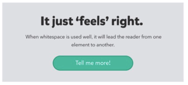
White space lets your eyes rest, and focus on one thing at a time.
Like this:

For this reason, white space is an active component of design.
And it has four functions.
1. White space creates balance

White space creates visual hierarchy, and there is power in balance.
Symmetry creates harmony. It is classic, orderly and safe:

In this example both sides are equal, which means an equal focus points, and equal choice when it comes to the CTAs. Take your pick, it’s your choice. All from white space.
Asymmetry, however, draws attention and sparks interest:

Here’s what probably happened when you saw that image:
- you looked at the model’s face first
- then the watch
- then went back to the image to read the headline
- then back to the watch again.
White space did that. Once your eyes had finished settling on the top part of the image (model’s face), they were slowly dragged across to the white space, to give you a good look at the watch.
So, white space gives you balance (and imbalance) depending on how you use it.
2. White space makes scannable copy

Good typography isn’t just about choosing a font.
Spacing between lines, paragraphs — even letters — all impact your copy’s legibility (how easily you identify specific letters and words) and readability (how well you scan the content).
Give your text some breathing room to get it read. Cram it all together (like T&Cs) to make people ignore it.
3. White space builds relationships

The law of proximity, or Gestalt theory, states that:
“objects that are near, or proximate to each other, tend to be grouped together”.
This means the space between elements decides how you perceive them.
If you want users to see things as “together”, lose a little bit of white space. But if you want something to stand out, let it stand out with some white space.
4. White space attracts attention

Clutter is ugly and annoying. For that reason, visual hierarchies demand white space to avoid clutter. The upshot is that the human eye is drawn to the something inside the nothing.
Want to know more about Visual Hierarchy? Here’s a great article that goes into some extra detail.
Helpful bits
White space isn’t all-powerful
You can have as much lovely white space as you want — if your content sucks, wave goodbye to the sale.
Always add a little bit more
A lot of people are scared by white space. They assume scrolling an empty space is enough to send someone away from their website forever, so they put as little white space as possible.
But think about this way: if your page is 50% white space, that means 50% of the screen has either text, images or buttons on it. That’s a hell of a lot.
Double your white space.
Group elements properly
If two or more elements are part of a distinct group (copy, form, CTA, for example), cut as much white space as you can without cramping the content.
Keep white space consistent
If you have 30 pixels of white space to the left of a paragraph, make sure it’s the same to the right. If your images are 20 pixels above a paragraph, make sure it’s 20 pixels below.
Consistency is key.
Your homework
Choose one of your pages and identify the most-cluttered section. Refine it to have more white space.
Not sure where to look?
Start with the space around buttons, paragraphs and images.
Then check out line-spacing, letter-spacing and margins.
Have fun.”
Once you finish reading the text inside the speech bubble, a door appears in the white room. You walk to door, open it, walk through it, and close it behind you.
You’re in a room.
