The Use Of Color Psychology In Marketing
Colors can trigger emotions and businesses have been using this for a long time. But how to choose the right color palette and balance it without overwhelming your visitors?
Day 26: Color
Have you ever wondered why we usually dress our boys in blue and our girls in pink? It’s an interesting story.
Turns out, color matters.

As soon as we perceive a color, our brain fires all sorts of signals to our bodies to release hormones that affect our emotional shifts. And it’s totally out of our control. The lesson here: if you’re angry, look at the sky; it’ll help you calm down.
As with everything, marketers want to use color to increase profits. They’re not wrong, plenty of companies have reported improved conversions just by changing button’s color.
But it’s not quite that simple.
Even though the power of color is unpredictable, there are some things we can control when it comes to how we use it on our websites.
So we’ll focus on that for now.
You can use color to hint at certain emotions
But that’s the extent of it.
You can lead a horse to water, but you can’t make it drink.
You can’t rely exclusively on fixed color/emotion pairings. But that doesn’t make it useless. For instance, they’re very useful when you’re doing competitive and market research.
Here are some common color/emotion pairings:
- Red: Confidence, youth, and power.
- Orange: Friendly, warm, and energetic.
- Yellow: Happiness, optimism, and warmth.
- Green: Peace, growth, and health.
- Blue: Trust, security, and stability.
- Purple: Luxurious, creative, and wise.
- Black: Reliable, sophisticated, and experienced.

Check out the colors your competitors use on their websites, and you’ll get a nice snapshot of the themes prevalent in your market.
You may choose to fit in or stand out depending on what you see; should you be a confident brand, a calming one? Should you make people happy, or get them thinking?
These are questions only you know the answer to, so have a think!
And before we move on — don’t play games with colour. You’ll never see a top-class lawyer’s office with a bright pink logo, just like a popular children’s toy brand won’t stick to monochrome.
K.I.S.S. – Keep It Simple, Stupid
When picking the colors for your website you should be as minimalist as you can get away with. A 10 color palette is only going to make extra work for you and confuse your visitors (“am I still on the same website?”)
Let’s say you’ve chosen this green (#44AF69) for your main brand color.
Next, we’ll use this website to find out the rest of our color palette. We’ll lock our green as the first color on the left and keep playing with options until we find a combo we like. Have fun with this!
Our starting point:

Not bad, it could work but we want our brand to be a bit more serious and formal. So we move on keeping in mind these points:
- Use the color you have (we’ve locked the green)
- Avoid competitors’ colors
- Keep your target audience in mind
- Don’t go with stereotype colors (i.e. blue and pink for dating apps)
- Have one color that stands out against your base color (great for CTAs and links), while others should blend in.
And we end up with this:

We have our green, a nice bold purple (you can see how we locked it, too) and some softer greys/greens.
The purple is our action (or accent) color (for CTAs), and the green is our base (for logos, navigation and footer).
All other colors can be used for decorative elements like icons or for section backgrounds.
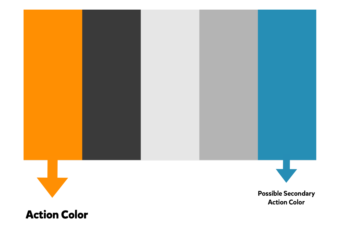
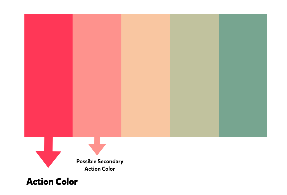
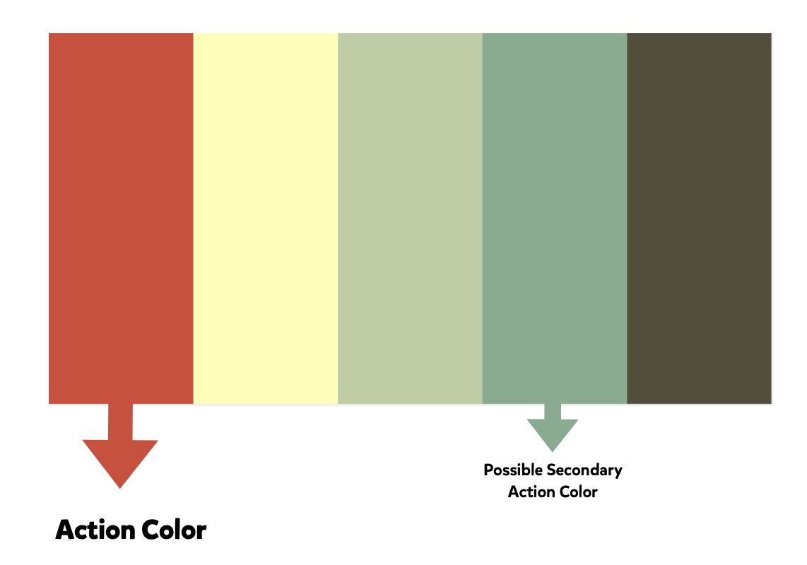
Here’s a few other examples of color palettes:


You can see we mention a “Secondary action color” here. These are good for secondary, less prominent CTAs and other branding But more on this later.
Let’s recap
To summarize, your color palette should include:
- A base brand color
- A primary action color
- An optional, secondary action color
- Supporting colors (if you want to keep it simple, stick to white plus dark and a light grey. Your CTAs will stand out even more).
There you go, you know more about color selection than the 90% of business owners out there!
Balancing your colors
We have our colors, now it’s time to design something that doesn’t look like a unicorn vomited all over your page after a heavy night of drinking paint.
There’s a cool system used by interior designers called the “60-30-10 rule”. You already know where this is going:
- 60% of your design should be your base color
- 30% goes to your secondary colors (all of them share this 30%)
- 10% goes to your action color (CTAs need to stand out, because they’re rare)
Nice.
Your homework
Follow the steps we outlined above and come up with a simple color palette (4-5 colors max). Pick your base color (if you don’t have one already), an action color and a secondary action color.
If your brand colors are already defined, focus more on secondary colors that you’ll use on your website. You can change them without affecting your brand’s noticeability.
Until next time.
